Create your first Python notebook to analyze the Covid-19
The Covid-19 pandemic shocked our entire world but also brought interest in data science and predictive analytics. John Hopkins University of Medicine led the field by compiling and releasing worldwide cases statistics on their well-known dashboard. It was an opportunity for myself to explore Python and its capabilities for data wrangling and data visualization on Covid-19 data when it became pandemic. In this article, I will share my beginner experience and walk you through how to create your first Python chart.
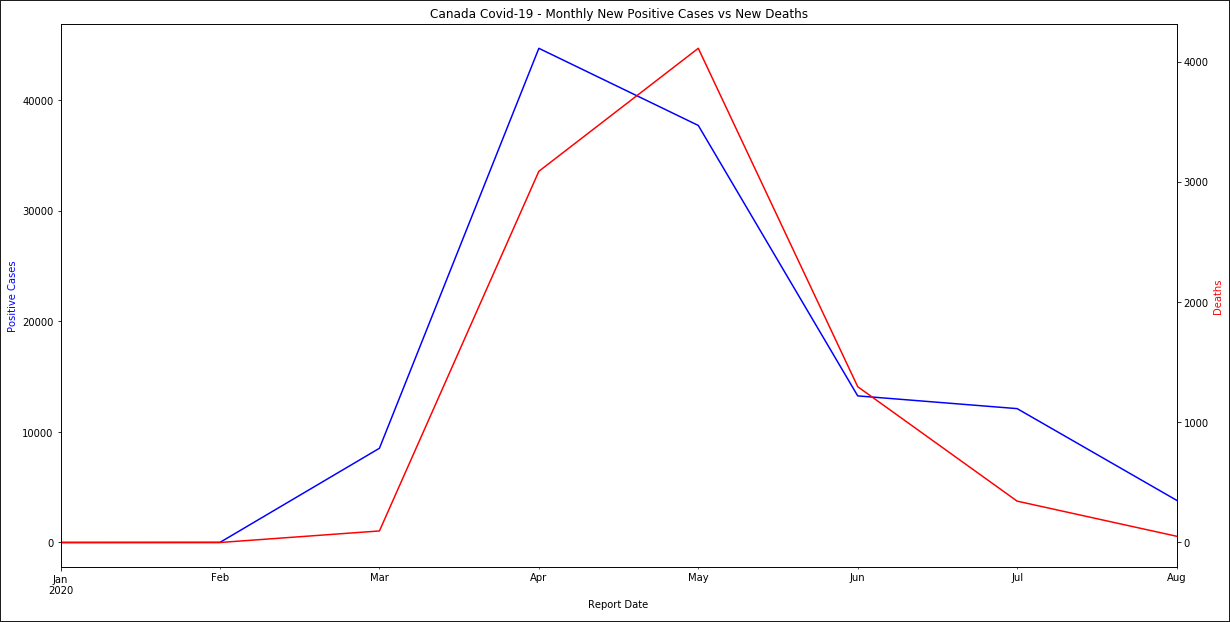
Canada Covid-19 Monthly New Cases and Deaths
Install Visual Studio Code, Python and Jupyter Notebook support
Microsoft Azure Notebooks preview has been available for free, unfortunately it will be retired on October 9th, 2020. It did provide a great web-based platform to develop IPython-style Notebook worry-free of software installation and configuration. Instead, I strongly recommend to use Microsoft Visual Studio Code, a powerful open-source code editor with wide-range of extensions. It is available for Windows, Linux and Mac OS, with built-in support for Source Control Management (SCM) Git.
Visit https://code.visualstudio.com/ to download Visual Studio Code.
Launch Visual Studio Code.
In Extensions, search for Python; install the extension published by Microsoft, it includes support for Jupyter Notebook.
You may need to restart the editor.
Get your Covid-19 data source
Several data sources on Covid-19 are available on GitHub, however I prefer the files shared by Tableau Software on Data.World. I find their CSV file easier to work with and though their data is updated daily only, this frequency is sufficient for our Python project.
Their data is sourced from The New York Times, the European Centre for Disease Prevention and Control, and the Public Health Agency of Canada. Not all countries' data may be included.
Visit https://data.world to create your account.
Go to this page https://data.world/covid-19-data-resource-hub/covid-19-case-counts.
On the file COVID-19 Activity.csv, click the Download button, then select Share URL.
Copy the link, it will be used to retrieve the data in your Python notebook.
Feel free to explore the file using Data.World viewer to get yourself familiar with the columns and data format of the file. The site also provides a convenient online querying tool to browse the data file.
Design your Python Notebook on Visual Studio Code
In Visual Studio Code, start a new Jupyter Notebook; use the command Ctrl+Shift+P then type Python: Create New Blank Jupyter Notebook to open a new .ipynb file.
 |
| Jupyter Notebook on Visual Studio Code |
The box where the cursor is located is called a Cell. Notebooks support two types of cells: Code and Markdown. To toggle a Cell between the two types, click on .
Code cells are for Python coding, while Markdown is a lightweight markup language for text formatting. Markdown is commonly used as .md extension files across SCM platforms like Git or GitHub. Markdown cells are convenient to present and describe the results of your Notebook.


Markdown language syntax and rendered output
Markdown cells will be automatically rendered when you leave the cell. On Code cells, click on to execute the code. New Cell is added for you, but you can insert a new Cell by clicking on the + button.
Enter the code below into your Code cell, replacing the URL you copied from Data.World. This script imports the popular pandas library and stores the CSV content into a Data Frame, Python’s grid data store structure for easy manipulation.
# Import pandas library.
import pandas as pd
# Define the columns to keep.
columns = ['REPORT_DATE', 'COUNTRY_SHORT_NAME', 'PROVINCE_STATE_NAME', 'PEOPLE_POSITIVE_CASES_COUNT', 'PEOPLE_DEATH_COUNT']
# Retrieve CSV file into Data Frame.
df = pd.read_csv('https://query.data.world/YOUR-OWN-URL', parse_dates=True, skipinitialspace=True, usecols=columns)
# Filter on Canada data only and store in another Data Frame.
canada = df.query('COUNTRY_SHORT_NAME=="Canada"')
# Explicitly format REPORT_DATE column to datetime.
canada['REPORT_DATE'] = pd.to_datetime(canada['REPORT_DATE'])
# Fill NaN count with 0.
canada['PEOPLE_POSITIVE_CASES_COUNT'].fillna(0, inplace=True)
# Display top 5 rows.
canada.head()
Execute the Cell; an asterix [*] on the left of the Cell indicates the code is being executed. A sequential number will appear when it has completed, indicating how many cell runs completed so far within your Notebook. The output is shown below.

Rendering a Data Frame to a graphical chart is fairly simple in Python. However, we need to pivot the province and territories into columns, then the plot() method can easily produce the line chart. Run the code below in a new Cell.
# Pivot the Province and Territories into columns and store into another Data Frame.
cases = canada.pivot(columns='PROVINCE_STATE_NAME', index='REPORT_DATE', values='PEOPLE_POSITIVE_CASES_COUNT')
# Plot the pivoted Data Frame into chart, lines by default.
cases.plot(figsize=(20, 10), title='Canada Covid-19 Cases')
This will produce a multiple lines chart by province and territories for Canada Covid-19 cases. You may need to click the Run button a second time to see the actual chart.
 |
| Canada Covid-19 positive cases by province and territory timeline |
Due to the huge population discrepancy between provinces and territories, this chart is not particularly interesting. Also there was no real data prior to March 2020. Let’s apply an additional filter and group some provinces and territories. Enter the following code in a new Cell then execute.
# Ignore data prior to March 2020.
groupCases = cases.query('REPORT_DATE >= "2020-03-01"')
# Group Maritimes Provinces
maritimes = ['New Brunswick', 'Newfoundland and Labrador', 'Nova Scotia', 'Prince Edward Island']
groupCases['Maritimes'] = groupCases[maritimes].sum(axis=1)
groupCases = groupCases.drop(maritimes, axis=1)
# Group Western Central Provinces
westCentral = ['Manitoba', 'Saskatchewan']
groupCases['West Central'] = groupCases[westCentral].sum(axis=1)
groupCases = groupCases.drop(westCentral, axis=1)
# Group Northern Territories
territories = ['Northwest Territories', 'Nunavut', 'Yukon']
groupCases['Territories'] = groupCases[territories].sum(axis=1)
groupCases = groupCases.drop(territories, axis=1)
groupCases.head()
The resulting Data Frame has grouped some provinces and territories together. We also filtered out rows prior to March 2020.

Add a new Cell then generate the chart with the grouped cases.
# Plot the grouped Data Frame into chart, lines by default.
groupCases.plot(figsize=(20, 10), title='Canada Covid-19 Cases')
The new lines chart with grouped provinces and territories looks like below example.
 |
| Canada Covid-19 positive cases timeline |
Python Data Frame includes many useful methods. Next we want to visualize the latest total deaths count. To do so, we find the last REPORT_DATE to filter the data on. Run the code below.
# Get latest REPORT_DATE available.
maxDate = canada['REPORT_DATE'].max()
# Filter on latest REPORT_DATE and store in another Data Frame.
deaths = canada.query('REPORT_DATE==@maxDate')
# Fill NaN count with 0.
deaths['PEOPLE_DEATH_COUNT'].fillna(0, inplace=True)
# Display top 5 rows.
deaths.head()
For this data visualization, we plot into bar charts and add the formatted date. To display the value of each bar on the chart, use annotate() along with patches to get the coordinates of the bars. On a new cell, input then execute this code.
# Visualize total deaths by province and territory with formatted date.
ax = deaths.plot.bar(x='PROVINCE_STATE_NAME', y='PEOPLE_DEATH_COUNT', title='Canada Covid-19 Total Deaths on ' + maxDate.strftime("%Y-%m-%d"), figsize=(20, 10))
# Display count value atop each bar, offset the top position by 100.
for p in ax.patches:
ax.annotate(str(p.get_height()), (p.get_x(), p.get_height() + 100))
The execution produces a bar chart of the total Covid-19 deaths by province and territories, with the total count value atop each bar.
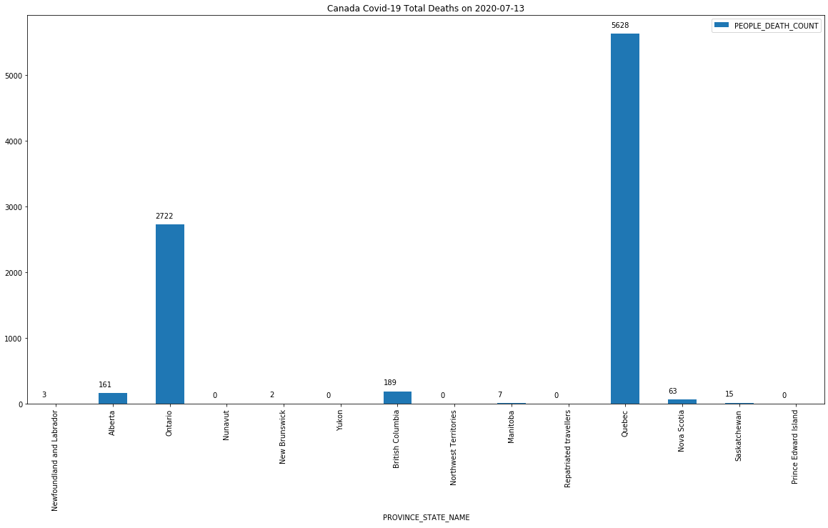 |
| Canada Covid-19 total death count by province and territory |
- Eric Chan
Related links
John Hopkins University of Medicine Coronavirus Resource Center
https://coronavirus.jhu.edu/map.html
Coronavirus (Covid-19) Data Hub
https://data.world/covid-19-data-resource-hub
Azure Notebook
Visual Studio Code
https://code.visualstudio.com/


Datawrapper is a tool for creating charts.Datawrapper is not a statistical package. It doesn’t have common statistical functions to guide you. Instead, it is a tool to translate your questions into a chart. It is a tool to quickly visualize statistics.
ReplyDeleteAwesome article, it was exceptionally helpful! I simply began in this and I'm becoming more acquainted with it better! Cheers, keep doing awesome! customised notebook singapore
ReplyDeleteWe have sell some products of different custom boxes.it is very useful and very low price please visits this site thanks and please share this post with your friends. singapore customised notebook
ReplyDelete